Terapage: Seamless Market Research Across Devices
Unparalleled Mobile-Compatible Market Research Platform
Terapage is a fully mobile-compatible market research platform designed to deliver a seamless experience across all devices. Whether accessed on a desktop, tablet, or smartphone, our platform ensures researchers and participants can engage effortlessly. With advanced cross-device functionality, Terapage empowers you to conduct impactful research without the need for additional downloads.
Get Started
Responsive Research Design for Every Screen Size
Terapage’s responsive design ensures that the platform adapts perfectly to any screen size. Participants can engage with research activities, review tasks, or complete surveys on their preferred device, while researchers can monitor progress and analyse data without interruption.
See Use CasesBrowser-Based Access: No App Downloads Required
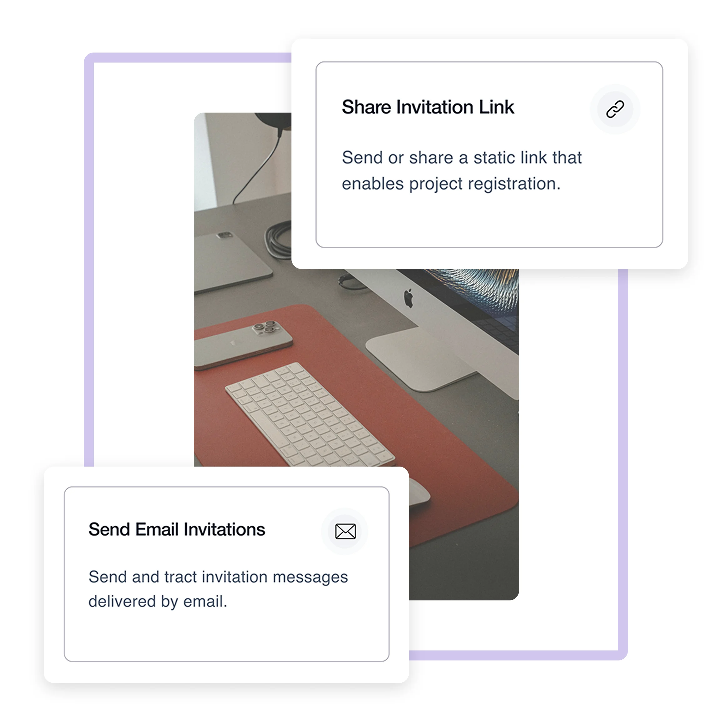
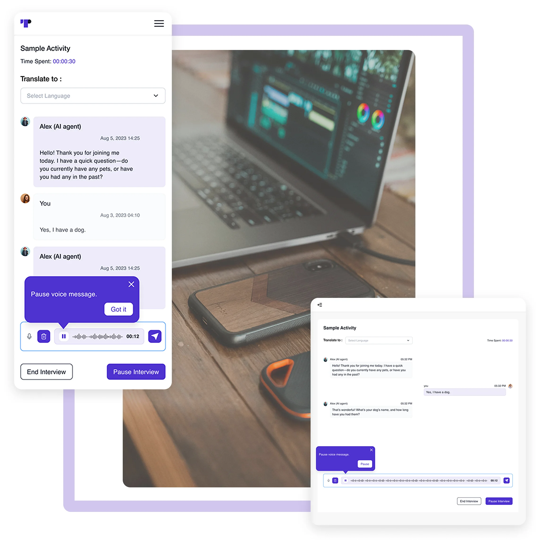
Unlike many platforms, Terapage operates directly through mobile browsers. Participants can join insight communities and complete tasks with a simple link, reducing barriers to entry. This streamlined approach ensures a hassle-free experience for participant recruitment.

Real-Time Sync Across Devices
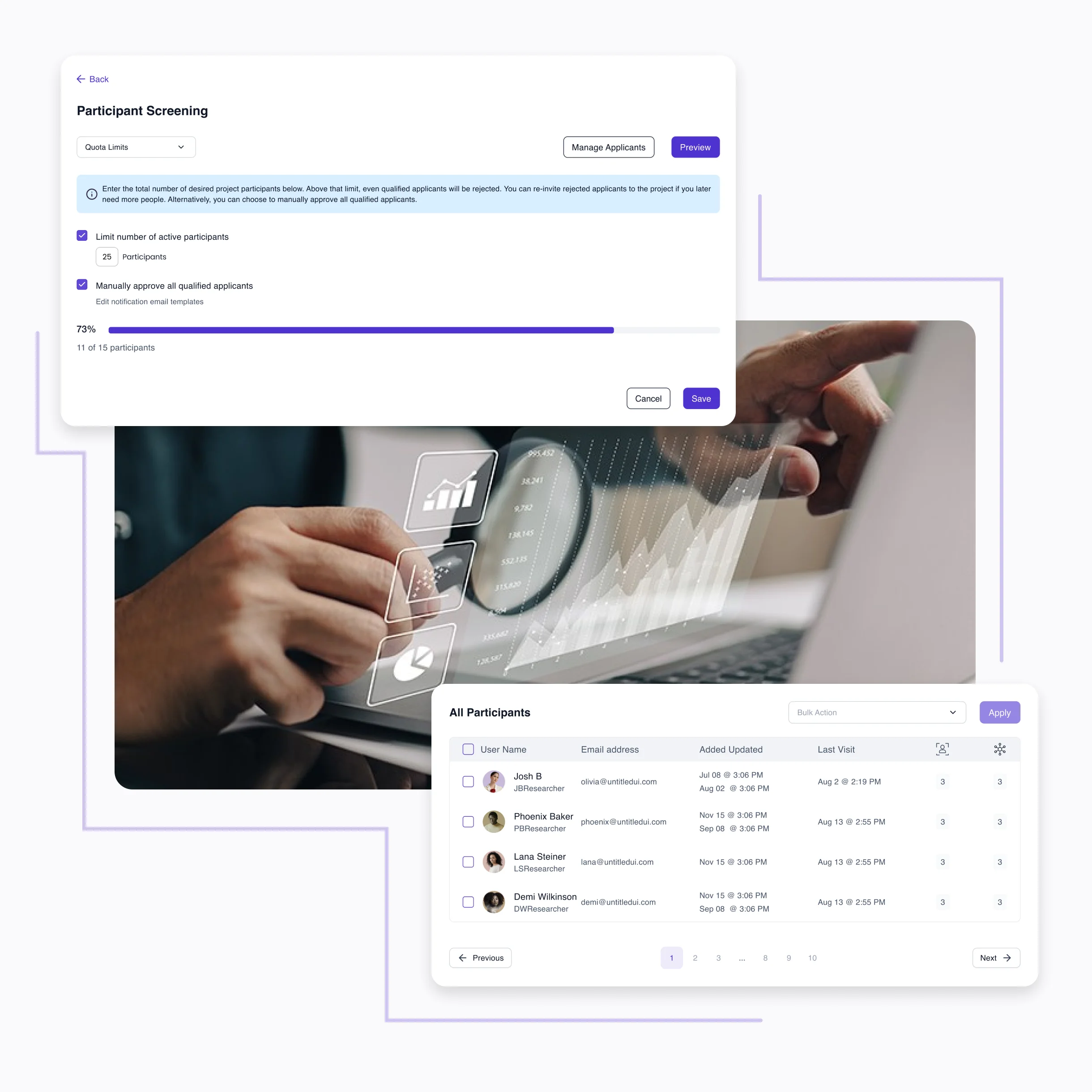
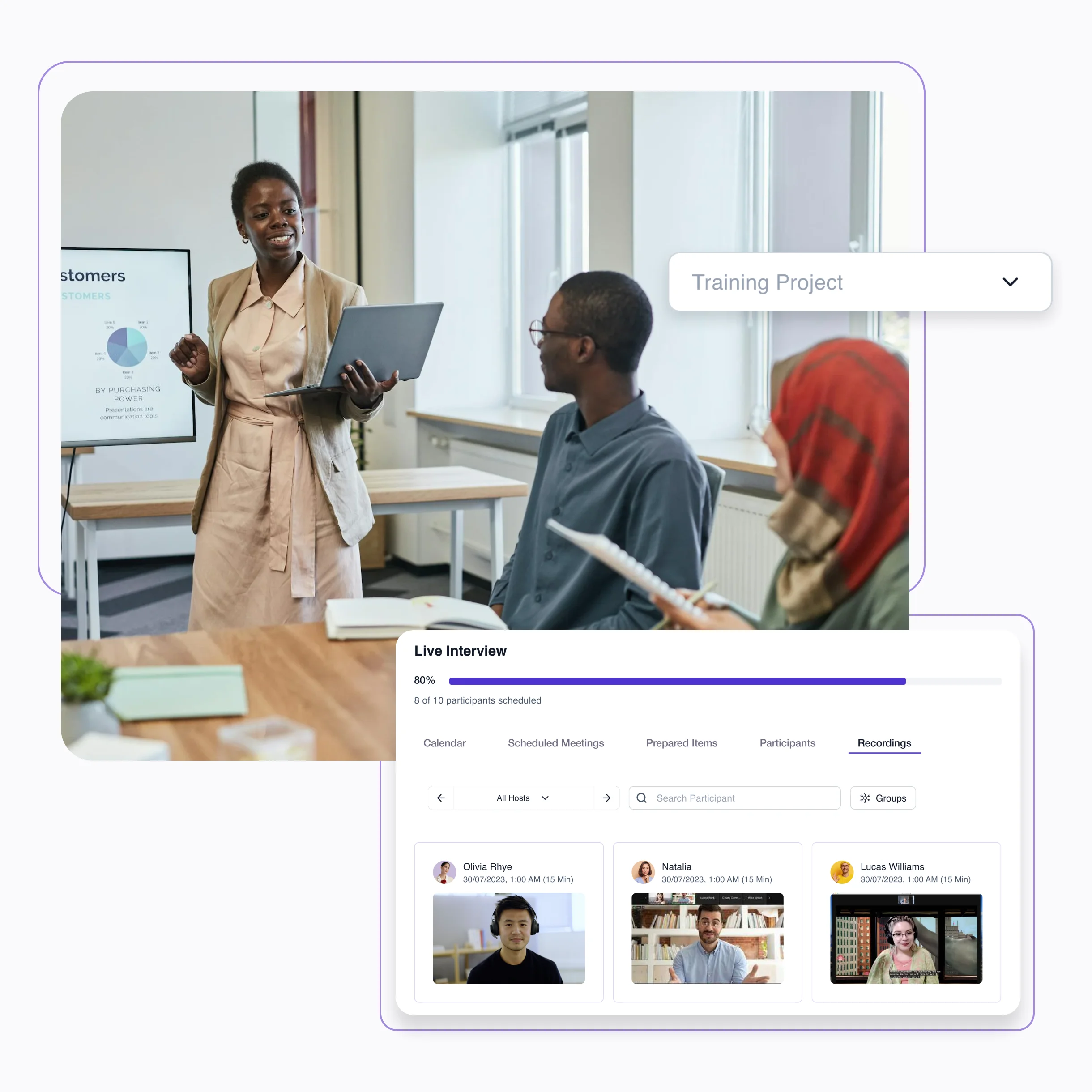
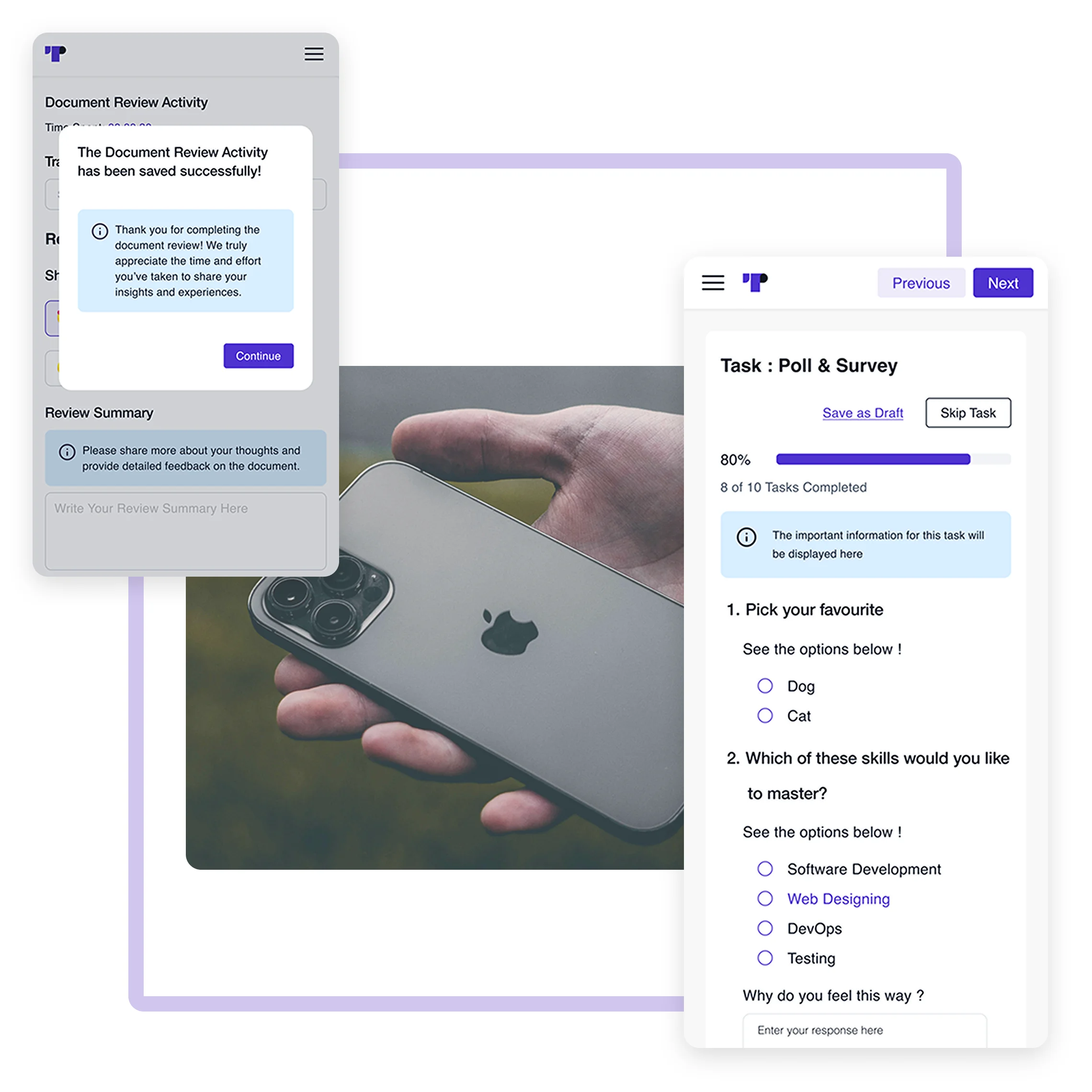
Terapage’s cloud-based infrastructure ensures that data is synchronised in real time. Whether a participant switches from their phone to a tablet, all progress is maintained via our Multi-task activity tracking.
See Use CasesMobile-Friendly Research Activity Design
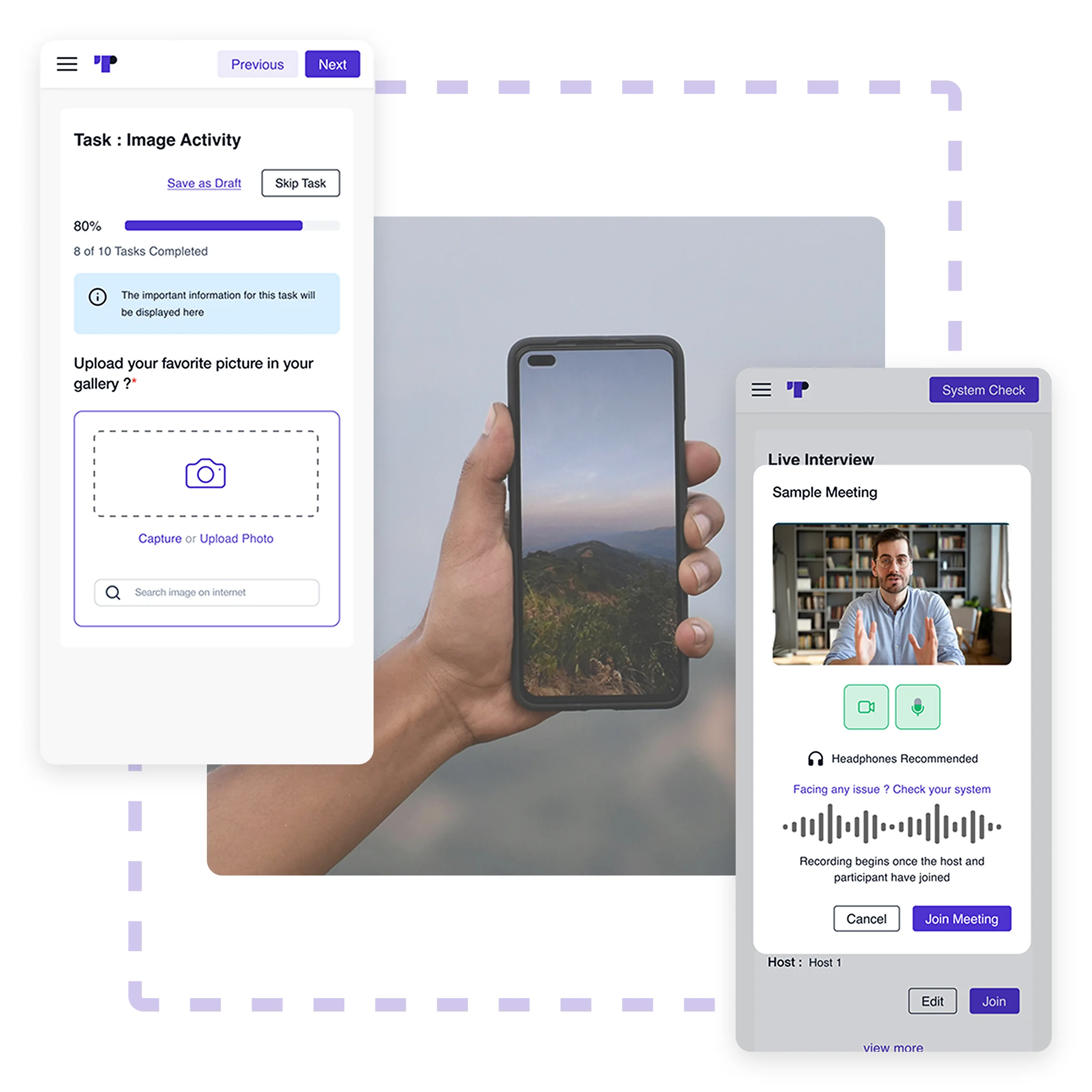
All activities are optimised for on-the-go completion. From automated interviews to discussion forums, each activity features touch-friendly interfaces.
Enhanced Accessibility for Participants
Terapage prioritises inclusivity. By removing the need for high-spec hardware, we facilitate broad participation across diverse groups, expanding the reach of your qualitative research.
See Use CasesStreamlined Navigation Across Platforms
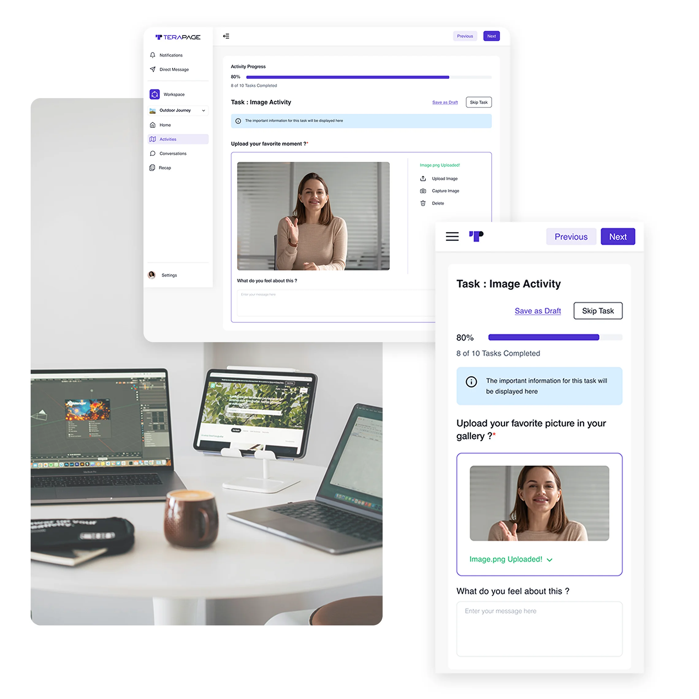
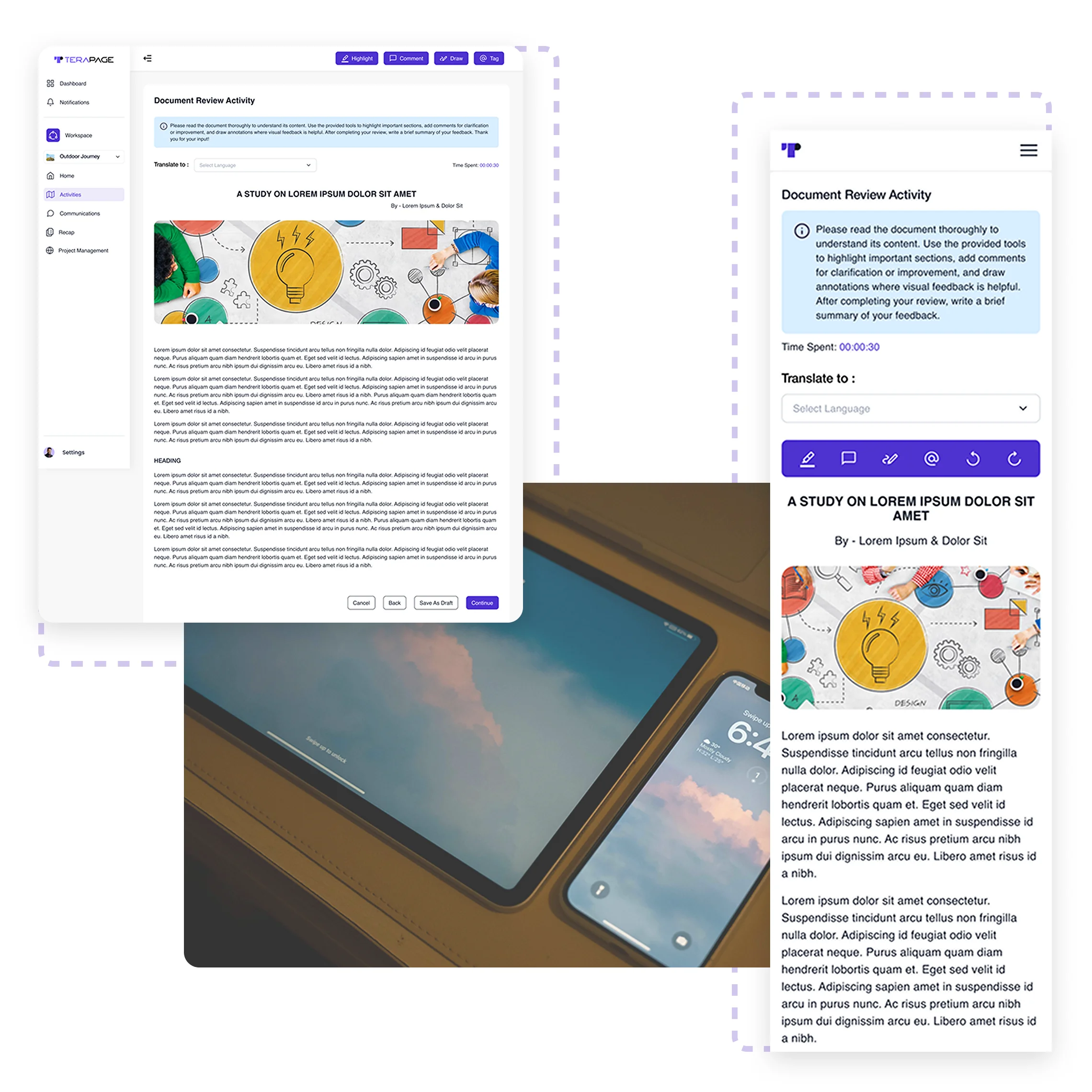
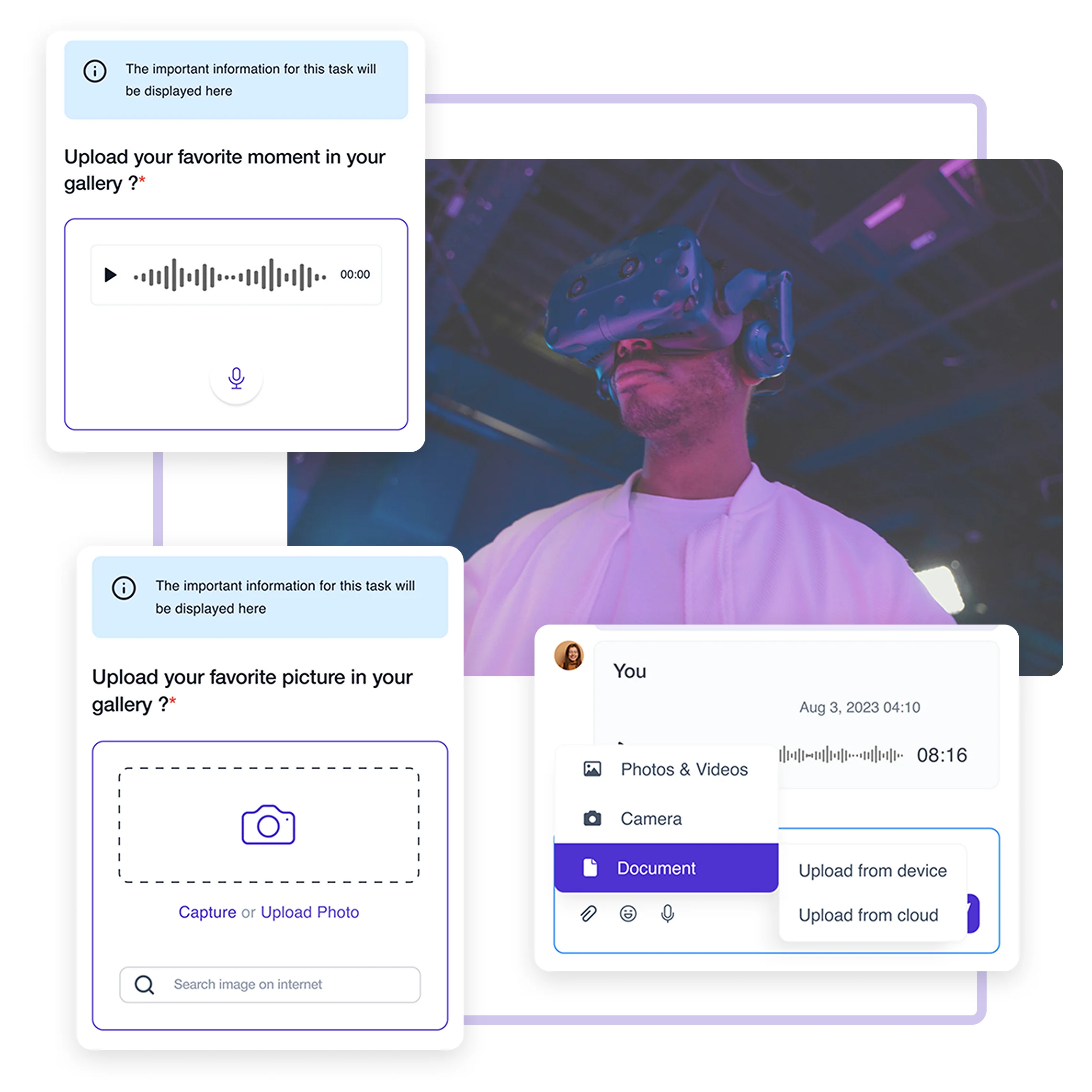
Participants can interact with multimedia elements like video guides directly. They can upload images or share audio files to capture authentic insights using Pulse by Terapage.
Intuitive Mobile Experience
The platform’s responsive design adapts seamlessly to mobile devices, providing participants with an optimised experience tailored to their screen size. From touch-friendly navigation to clear layouts, Terapage ensures that all tasks—surveys, discussions, polls, or multimedia uploads—are easy to complete, even on smaller devices. This mobile-first approach supports on-the-go participation, enabling users to contribute insights from anywhere, at any time.
See Use CasesInteractive Multimedia Engagement
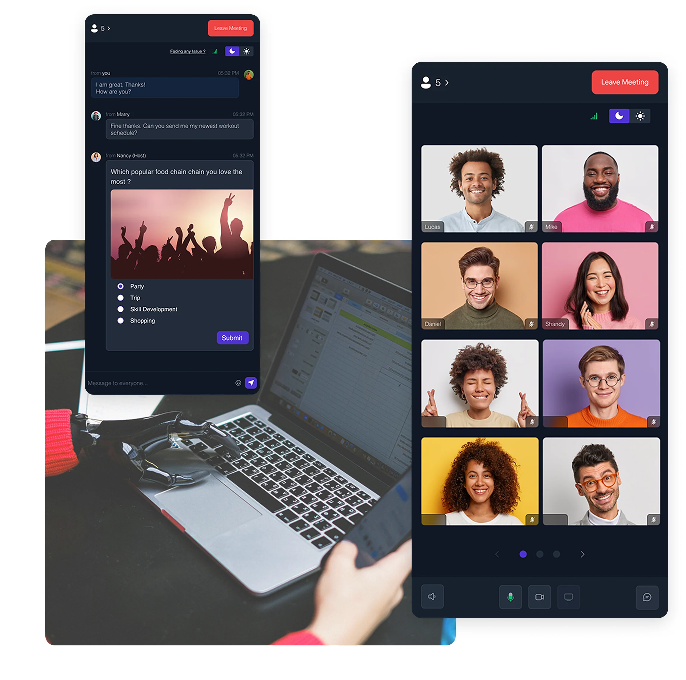
Terapage enables participants to interact with multimedia elements directly from their mobile devices. They can upload images, record videos, and share audio files with just a few taps, making it easy to capture real-world context and authentic insights. The platform’s support for rich media encourages deeper engagement, allowing participants to share their thoughts creatively and intuitively.
And more platform features & capabilities...


Extra services to ensure that you succeed
We understand that our platform may need to be supported with both the standard and optional packages in order to help you succeed in the research, that is why we offer valuable services that are customised according to the needs of your research.